Real-Time Seat Selection for Sports Venues and Stadiums
How stadiums handle 30k+ seat charts in real time: WebGL rendering, level-of-detail switching, lock-per-click flow, and on-sale traffic resilience.
A guide to interactive seating charts for theatres: multi-level rendering, accessibility zones, price tiers, obstructed-view seats, and SVG plan import.
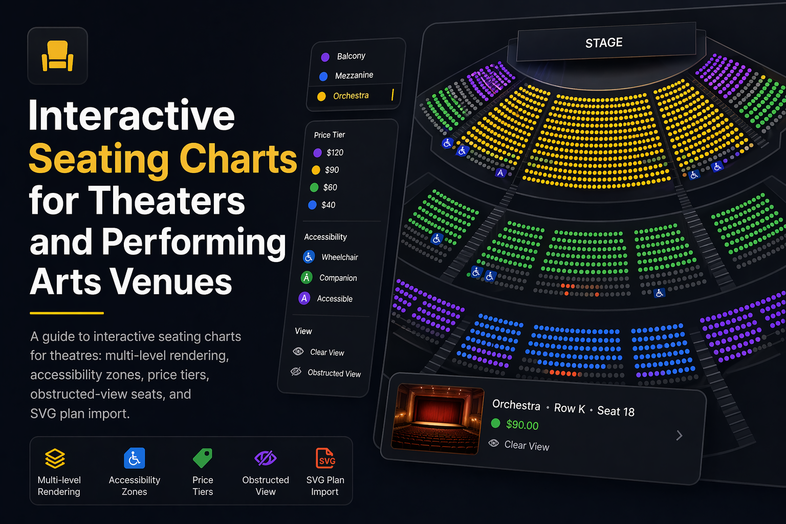
Theatres and performing arts venues sell seats in a way almost no other venue type does. A single auditorium has an orchestra floor, a raked mezzanine above it, one or two balconies higher still, side boxes around the perimeter, and a handful of obstructed-view seats where a pillar, a lighting rig, or an architectural curve blocks the stage. Pricing runs five or six tiers deep. Accessible seating has to be both regulation-compliant and socially invisible – buyers in wheelchairs should not be pushed into the worst seats, and their companions need to sit next to them. On top of all of that, many theatres operate out of historic buildings where no two rows are the same shape.
A generic grid-style seat picker cannot model any of this honestly. This guide walks through what changes when you adapt an interactive seating chart to a theatre or performing arts venue, what features matter in production, and how Seatmap Pro approaches each of them.
Before choosing any tool, it helps to understand why theatres break the defaults that ship with most seat pickers.
Every decision about the chart – what renders at what zoom, where the price legend sits, how accessibility is surfaced – has to make sense against this list.
The cleanest way to model a theatre is as a set of sections, one per physical level, with a section overview that buyers use to pick a level before drilling into individual seats.
When the chart first loads, the buyer sees the whole auditorium from above – orchestra in the middle, mezzanine floating behind it, balcony above that, side boxes around the edge. Each section is colour-coded by the cheapest seat it contains, so at a glance the buyer understands the price structure. A click or tap on a section zooms into that level, switches the renderer to seat-level detail, and surfaces row numbers.
Behind the scenes, each level is a section in the venue schema. Sections can have their own rotation, row-numbering convention (alphabetical from stage, reversed in some balconies), and render order. In Seatmap Pro the venue schema stores each as a first-class object, and the venue editor has dedicated tools for stacking balconies above the orchestra in the visual workshop.
The key ergonomic choice is that buyers should never have to “pan up” to find the balcony. The section overview gives them the whole auditorium at once; only when they commit to a level do they zoom in.
Historic theatres almost never fit a grid. The Royal Albert Hall, the Old Vic, the Teatro La Fenice, and thousands of regional playhouses have asymmetric plans with curved rows, side boxes, and partial-depth balconies.
The most reliable production workflow for venues like this starts from the architectural drawings. An architect or interior designer exports the auditorium floor plan as SVG from Illustrator or a CAD tool, and the seating chart editor accepts that SVG as a background underlay. Sections, rows, and seats are then placed on top of the underlay so the chart matches the physical venue down to the centimetre. For a longer walkthrough of the SVG workflow – coordinate systems, viewbox sizing, and common export mistakes – see SVG basics for seating charts.
For venues without digital drawings, a photograph of a paper plan or a Google Maps satellite view can be used as a raster underlay while the seats are laid out visually. Seatmap Pro’s editor supports both SVG and raster underlays and uses a snap-to-grid tool for rows that are mostly regular. Once the layout matches the venue, the underlay can be removed from the published chart or kept as visual context.
The Art of Design blog post walks through a real example of modelling an irregular venue by hand, and Visual Workshop covers the cosmetic tooling.
Every older theatre has seats where a pillar, a lighting truss, a projection box, or a balcony overhang partially blocks the stage. In some venues these are a few isolated seats; in others they are full rows at the back of the orchestra where the mezzanine overhang cuts off the top of the proscenium.
Selling these honestly matters for two reasons. First, refund liability – a buyer who did not know about the pillar has a valid grievance. Second, inventory velocity: obstructed seats that are clearly flagged and discounted sell faster than “standard” seats buyers will complain about afterwards.
In an interactive chart, obstructed seats should be:
restricted: true or similar), so backend rules and analytics can reason about them.Seatmap Pro models obstructed seats as a seat-level category with custom styling, ties them to a dedicated price tier, and supports view-from-seat image attachments per seat or per seat cluster. The 2D vs 3D post covers the data on why 2D plus view-from-seat photos outperform full 3D for communicating sightlines.
Accessibility zones in a theatre chart are not a colour choice – they are a legal and social design problem.
Compliance requirements vary by jurisdiction but share common themes. In the US, ADA requires that wheelchair-accessible seats be available across the full range of ticket prices, that companion seats be adjacent, and that accessible seats be dispersed across the venue rather than clustered in one section. In the UK and EU, similar proportional-distribution and companion-pairing rules apply. The chart must enforce these at the schema level, not leave them to ticketing staff to remember.
Buyer experience matters as much as compliance. An accessible-seat filter should let the buyer toggle on wheelchair-accessible seats, companion-pair seats, and transfer-accessible seats, and the chart should render a legend that uses both colour and icon. Screen-reader users need a parallel list-view fallback since Canvas and WebGL pixels are invisible to assistive tech. Seatmap Pro ships an accessibility list view keyed off the schema’s accessibility attributes, so a buyer using VoiceOver or NVDA gets the same inventory with the same hold rules.
Operational rules live on the backend. When a buyer selects a wheelchair seat, the system can automatically hold the paired companion seat for 60 seconds while they complete selection. If they do not select the companion seat, the hold releases. Inventory reports for venue operators separate accessible inventory by price tier, so quotas can be audited before a show goes on sale.
This layer of behaviour is where a generic seat-picker library stops being enough. Rendering an accessibility zone is trivial; enforcing ADA-compliant pairing and dispersion rules in production is where the Booking API earns its keep.
Theatres often have five to eight price tiers where a stadium has three. Getting the legend right is a UX problem in its own right.
The default price-tier colouring should communicate three things at a glance: which sections are most expensive, where the mid-tier seats are, and where the low-priced inventory sits. A common pattern is a single-hue ramp (deep red for premium, fading to pale pink for the cheapest tier) so tiers remain ordinally legible even on low-contrast displays. Avoid rainbow palettes – they are harder to parse and fail for colour-blind users.
Dynamic pricing adds a layer. If premium centre orchestra is selling quickly and mid-balcony is lagging, a pricing engine can adjust tiers mid-run; the chart has to re-render the legend and the section colours in real time. The buyer who opens the page an hour later should see the new tier without a page reload.
Seatmap Pro models prices either inside the venue schema (static pricing, simplest) or via the Booking API (external pricing, dynamic). External pricing lets a revenue-management engine push updates and the renderer recolours tiers live without disturbing buyers mid-selection. The Transforming empty seats into revenue post covers the commercial logic of tier adjustments and fill-the-house strategies.
Many theatres and opera houses sell season tickets where a subscriber sits in the same seat across a whole season of performances. The chart has to model this without confusing single-ticket buyers.
The pattern is inventory segmentation: a season-ticket subscriber’s seat is held for every performance in the series, even if the subscriber has not “bought” the individual performance yet. For single-ticket buyers those seats show as unavailable from the moment the event goes on sale. When a subscriber releases a seat – cancelling a show, for example – it flips to available mid-run and the chart reflects the change without a reload.
Implementing this cleanly is a backend problem; the chart just renders the state the Booking API returns. What matters on the chart side is that the buyer never sees a stale availability state, and that the held-seat visual is the same as any other unavailable seat (subscribers are not public information). Seatmap Pro’s Booking API v2 supports multi-hold semantics and series-level inventory so season tickets map naturally onto it.
A lot of theatres are rental houses – the building hosts a touring production for a week, a local dance company the next, and a corporate event the week after. Each event needs its own seating configuration, often with sections held for promoters, accessibility quotas adjusted per production, and pricing that changes night by night.
The cleanest architecture is one venue schema (the auditorium’s physical seats) and many events (each performance or run). The chart renders the same venue but different inventory and pricing per event. When a tour asks for 200 seats held for the production company, the operator marks them held at the event level without mutating the venue schema. When the next production comes in, those holds release automatically.
Seatmap Pro’s Events Hub uses this pattern – venue schemas are reusable assets, events are lightweight, and inventory modifications are scoped to the event. For rental houses running 200-plus events a year, this is the difference between two hours of setup per event and two weeks.
If you are evaluating interactive seating chart software for a theatre, here is the shortlist of questions that matter in production:
A yes on every question takes ten minutes to verify with a live demo. A vendor who hedges on any of them is a vendor whose chart will show a pillar-blocked seat as “standard” three weeks after you go live.
Seatmap Pro was designed with performing arts venues as a first-class use case. Multi-level schemas, SVG underlay import, obstructed-view handling with view-from-seat imagery, accessibility list-view fallback, five-plus price-tier colouring, and the Booking API v2 for held inventory, dynamic pricing, and rental-house events are all built into the platform rather than bolted on. Whether you run a 300-seat regional playhouse or a 2,500-seat performing arts centre with a touring roster, the editor and renderer adapt to the venue rather than forcing the venue into a grid.
To see the chart running against a theatre close to yours, request a demo – we will pick a sample auditorium and walk through the orchestra/mezzanine/balcony flow, accessibility handling, and view-from-seat preview. If your team is more technical, How to build a JavaScript seating chart for your website covers the developer path and the Renderer Playground lets you test the renderer against real venue data without signing up.
For the commercial picture, Transforming empty seats into revenue and 8 ways to scale your venue revenue cover dynamic-pricing, subscription, and fill-the-house strategies that have been proven on real theatre deployments.
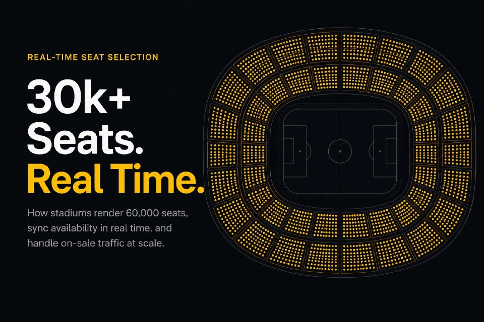
How stadiums handle 30k+ seat charts in real time: WebGL rendering, level-of-detail switching, lock-per-click flow, and on-sale traffic resilience.
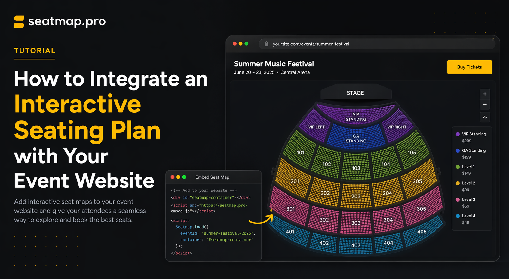
A non-technical guide to adding an interactive seating plan to your event website -- iframe vs SDK, what your dev team needs, timeline, and vendor questions.
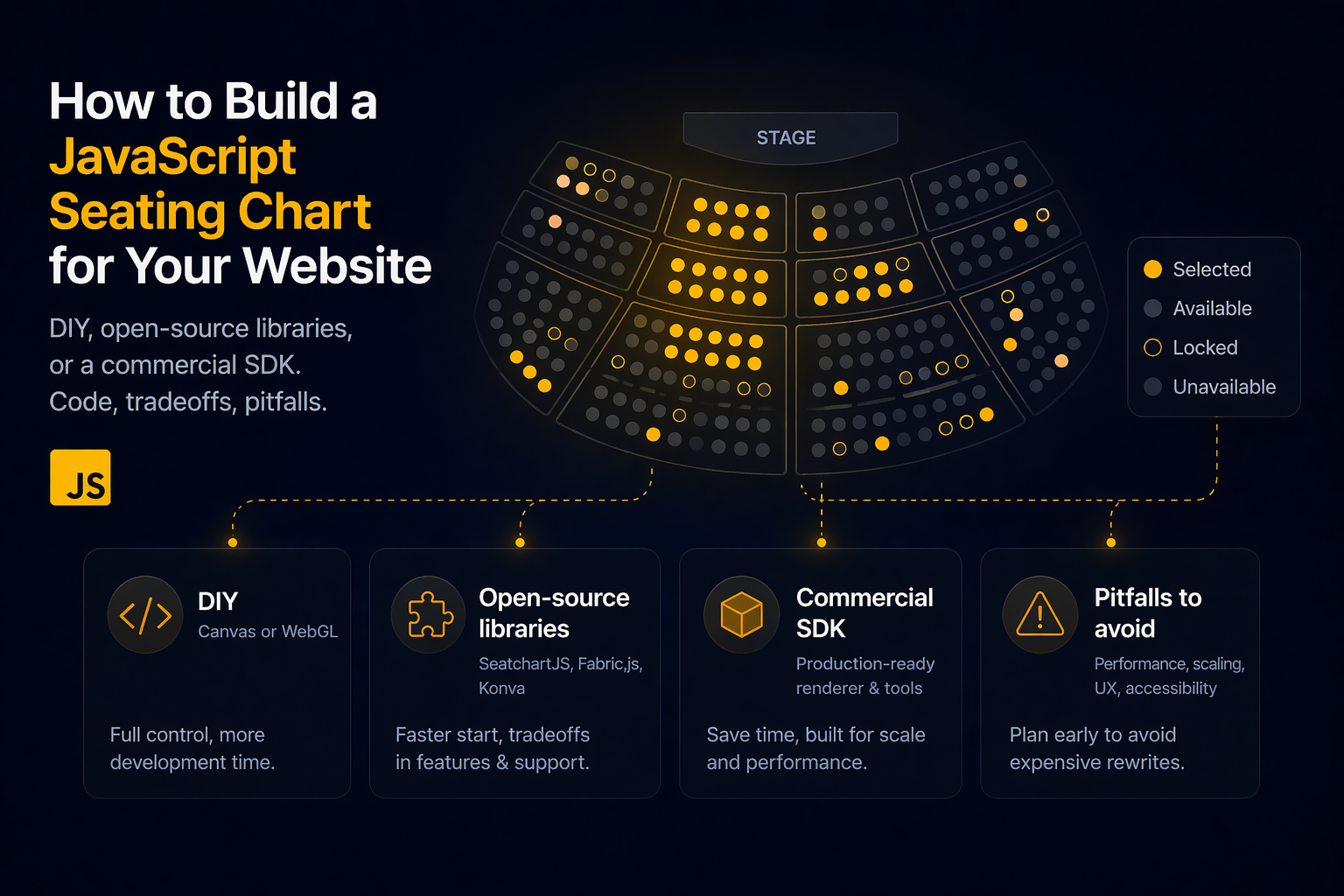
Build a JavaScript seating chart: DIY Canvas/WebGL, open-source libraries (SeatchartJS, Fabric.js, Konva), or a commercial SDK. Code, tradeoffs, pitfalls.